Bark – Modern Construction & Modular Living
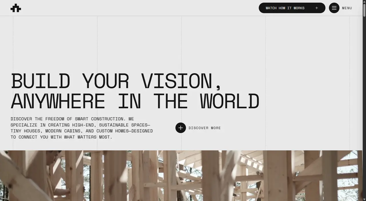
Bark is a refined, high-performance digital template specifically engineered for architecture studios, construction firms, and design-led brands that require a premium, editorial-grade web presence. The primary goal was to bridge the gap between sophisticated visual storytelling and ultra-lean technical architecture, ensuring that heavy visual content never compromises loading speeds or user experience.
Tech Stack
For this project, I chose a cutting-edge stack focused on extreme performance, scalability, and a superior developer experience (DX):
- Framework: Astro 6, utilizing its content-first architecture to generate ultra-fast static and dynamic pages.
- Language: TypeScript for end-to-end type safety, ensuring a robust and error-free codebase.
- Styling: Tailwind CSS v4, implementing a modern design token system for effortless brand customization.
- Animations: GSAP for choreographed entrance sequences and Lenis for global smooth scrolling, providing a high-end, immersive feel.
- Backend & Forms: Astro Actions with Zod schema validation and Resend for reliable transactional email delivery.
Technical Challenges & Solutions
1. “Full Astro” Architecture (Zero-Island Approach)
While many modern templates rely on heavy UI frameworks like React or Vue, I built Bark using pure Astro components and native TypeScript. This approach eliminates unnecessary JavaScript “bloat” on the client side, resulting in near-instantaneous page loads while maintaining complex interactive animations.
2. Hybrid Rendering Strategy
I implemented a hybrid rendering strategy using the Vercel adapter to balance speed and functionality:
- SSR (Server-Side Rendering): Used for the homepage and contact form to handle dynamic logic and secure server-side validations.
- Prerendering: Applied to the blog and project case studies, ensuring these content-heavy pages are static, SEO-friendly, and served instantly via CDN.
3. Type-Safe Content Management
Leveraging Astro Content Collections, I created a scalable system for managing projects and blog posts. Every piece of technical data—such as location, square footage, and project categories—is strictly validated via Zod schemas, preventing broken layouts and ensuring data integrity.
Featured Highlights
- Editorial & Responsive Design: A layout inspired by high-end design magazines, featuring unique “polygon-clip” geometric effects and a grid system that adapts perfectly to mobile, tablet, and desktop viewports.
- Cinematic Motion: Professional GSAP-powered transitions and scroll-reveal effects that guide the user’s attention toward featured work.
- SEO & Performance Engineering: Includes automated sitemap generation, RSS feeds, and centralized metadata management to ensure the site ranks well and shares beautifully on social platforms.
- Comprehensive Documentation: A detailed technical guide is included, covering everything from the component architecture to animation hooks, making the codebase easy to extend for any professional studio.
Conclusion
Bark serves as a masterclass in modern web engineering. It proves that a site can be visually rich and animation-heavy while maintaining perfect performance scores. By combining Astro 6 with TypeScript, I delivered a production-ready foundation that is as scalable as it is beautiful.
Technologies:
Astro
GSAP
Tailwind
Typescript
Astro
GSAP
Tailwind
Typescript